The Green Dot
As part of Two°Creative’s open brief to reimagine The Green Dot, symbol submissions could not contain arrows or convey a cycle.
Since 1970, arrows chasing in a cycle has meant recycle or recycled. In 1990, The Green Dot adopted the same graphic motif, with a different meaning. We believe this has to change.
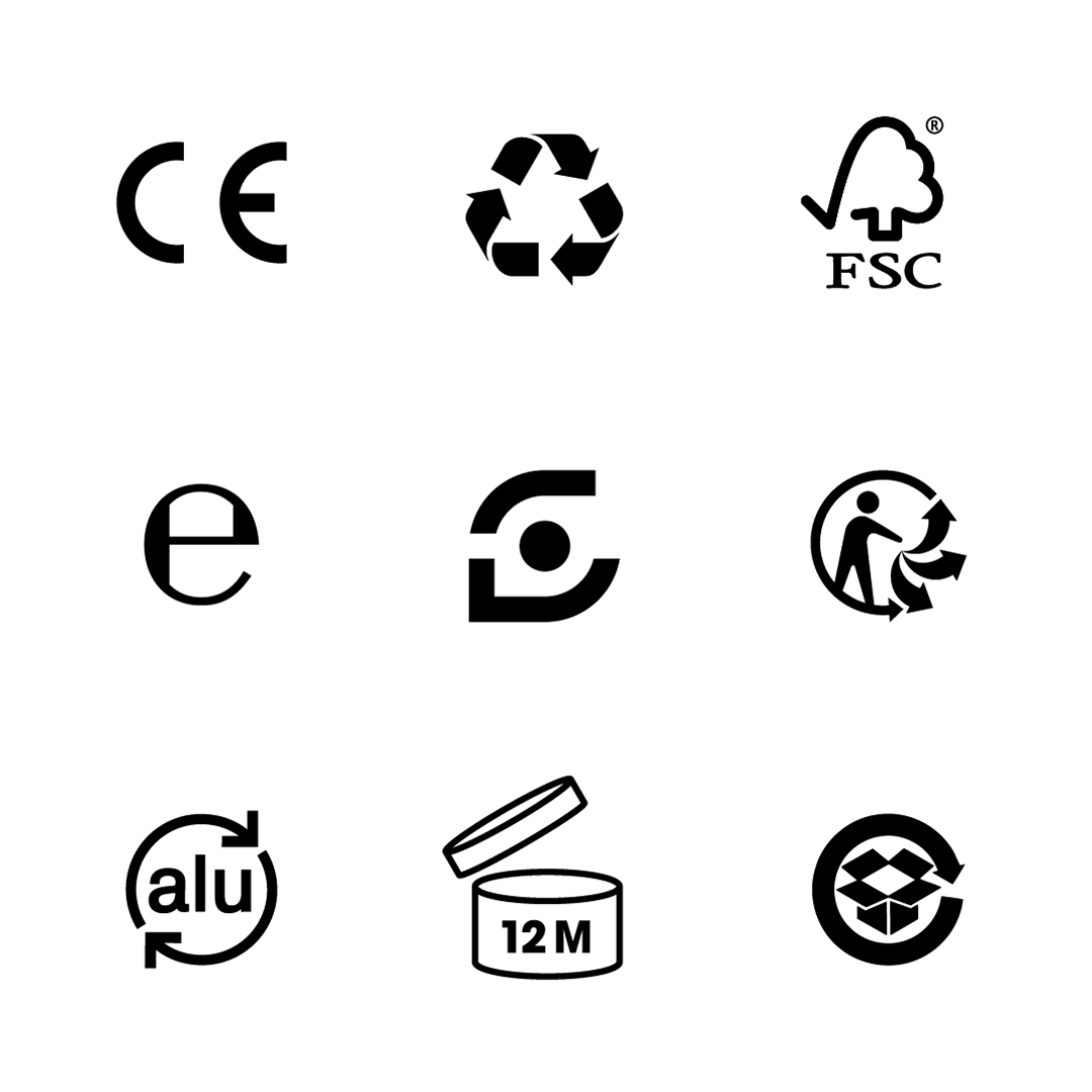
The symbol is used by 130,000 companies, appearing on over 400 billion packages every year and is regularly confused with the recycling symbol. It does not mean the product is recyclable and is causing widespread confusion and resulting in huge amounts of recycling contamination.
The Green Dot is not fit for purpose. Change the symbol. Change the system.
When
2022
What
Symbol design
Motion
Solution
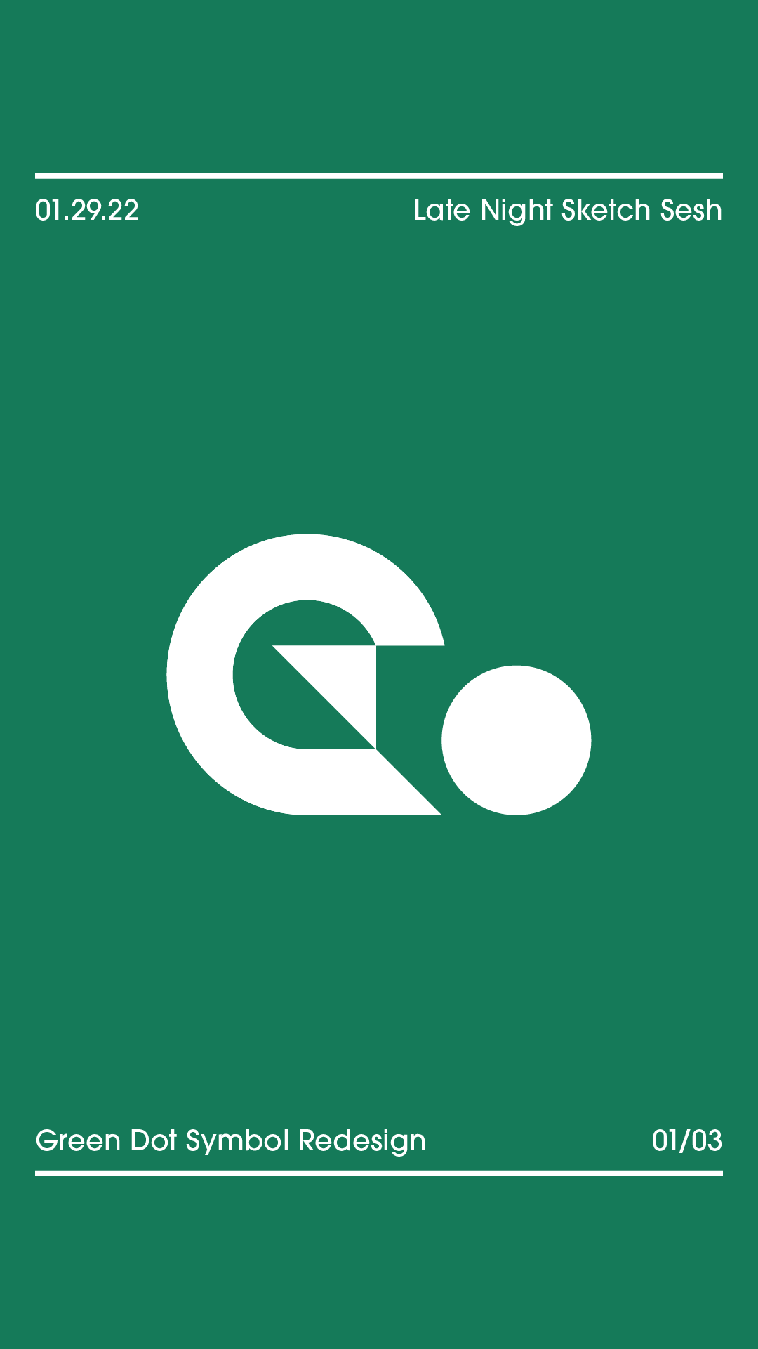
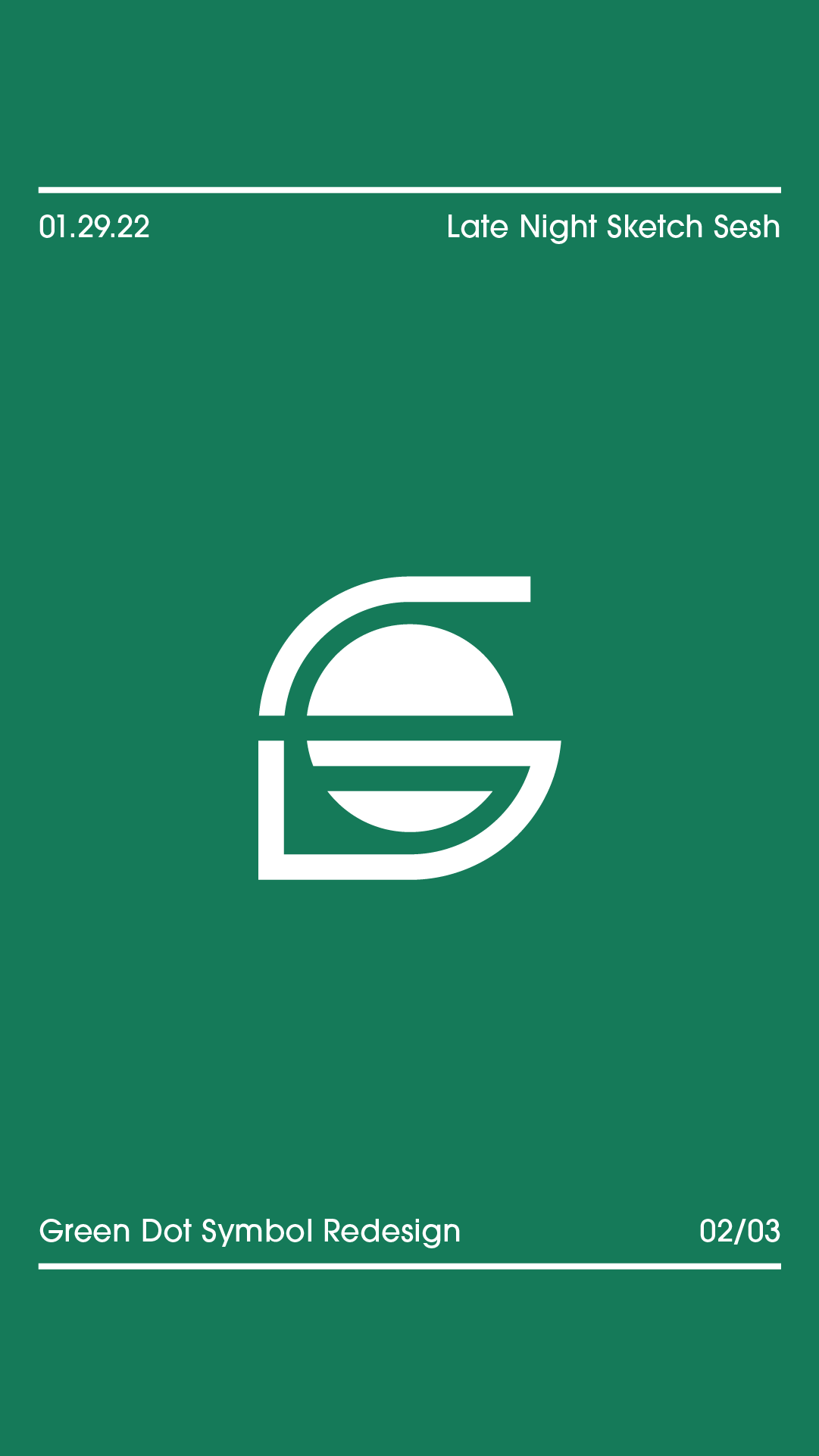
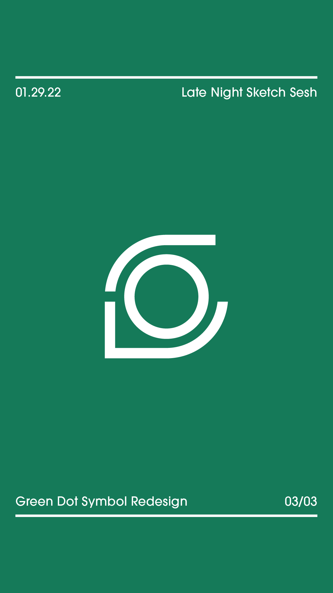
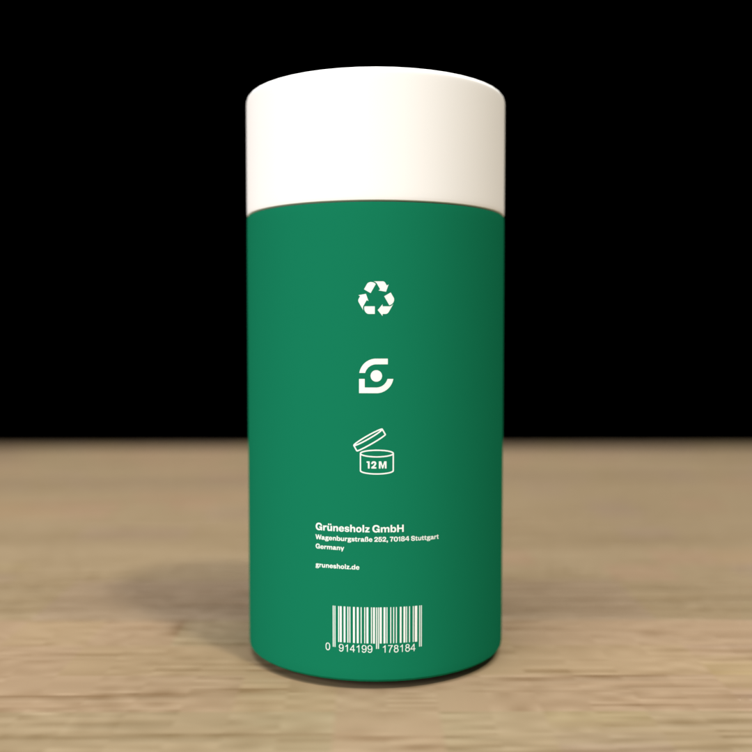
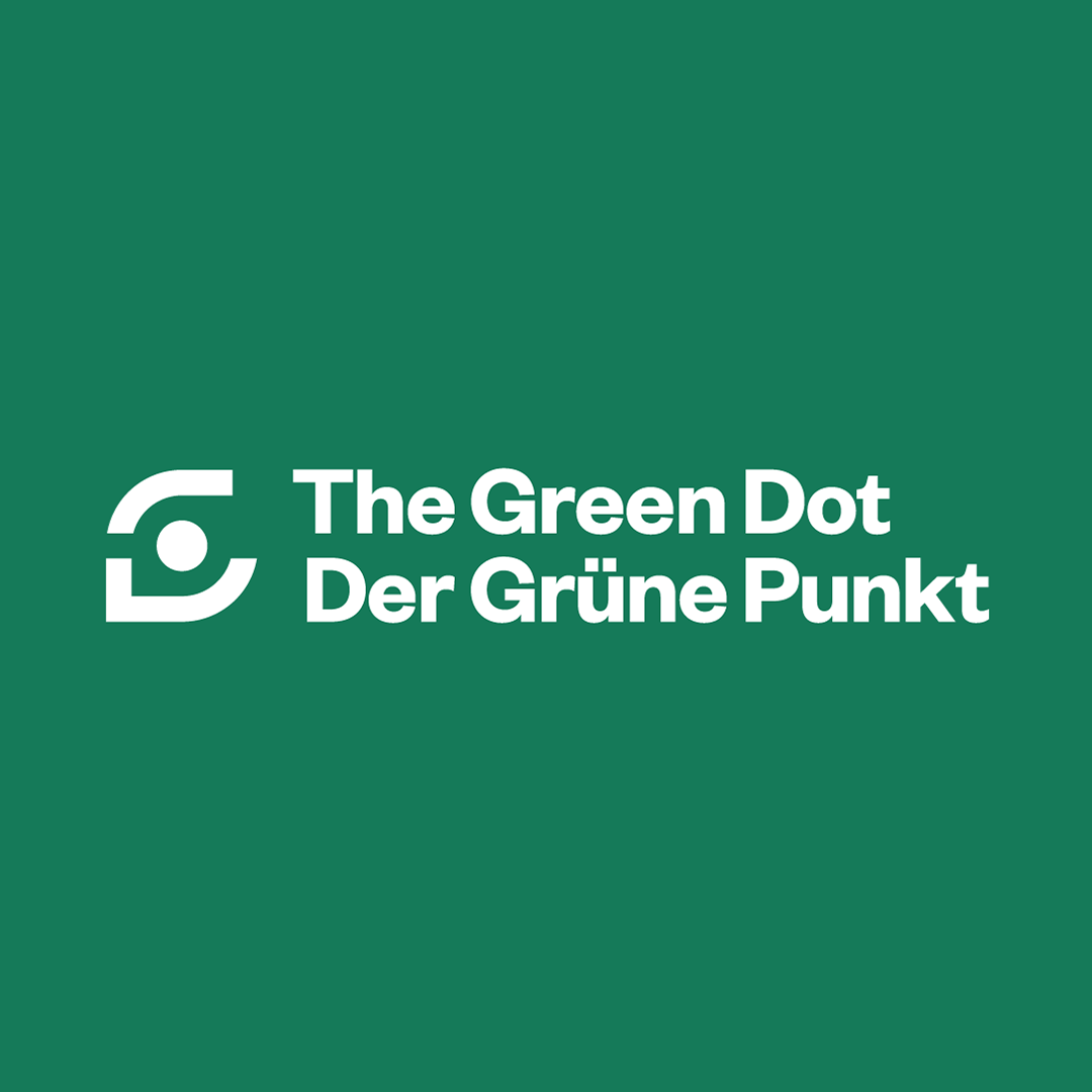
This reimagined Green Dot symbol is composed of a dot at its center, surrounded by two bold strokes that form an abstracted G. While those characteristics quite literally call back to the symbol’s given name, the arrangement of the components also provide a pictorial representation of two hands cradling the dot. This is both symbolic of the transactional nature of the Green Dot system and its participants, but also evoke the sense of care and responsibility required to safeguard our planet.


