HEART HAUS
Crafting an award-winning identity for a newly integrated in-house creative team
Heart Haus is the in-house creative team at CVS Health. My fellow creatives and I built this bold identity system to represent our expertise through strategic and creative partnership across our enterprise, as well as to the broader creative community outside of CVS Health.
Our objectives were to develop a bold visual expression using elements of the CVS Health visual identity that reinforced the new team’s name, and that would be visually compelling and distinct in the broader landscape. Continuity with the CVS Health brand identity was paramount. We strived to develop a system that could be traced back to our enterprise brand, while also dialing up visual impact.
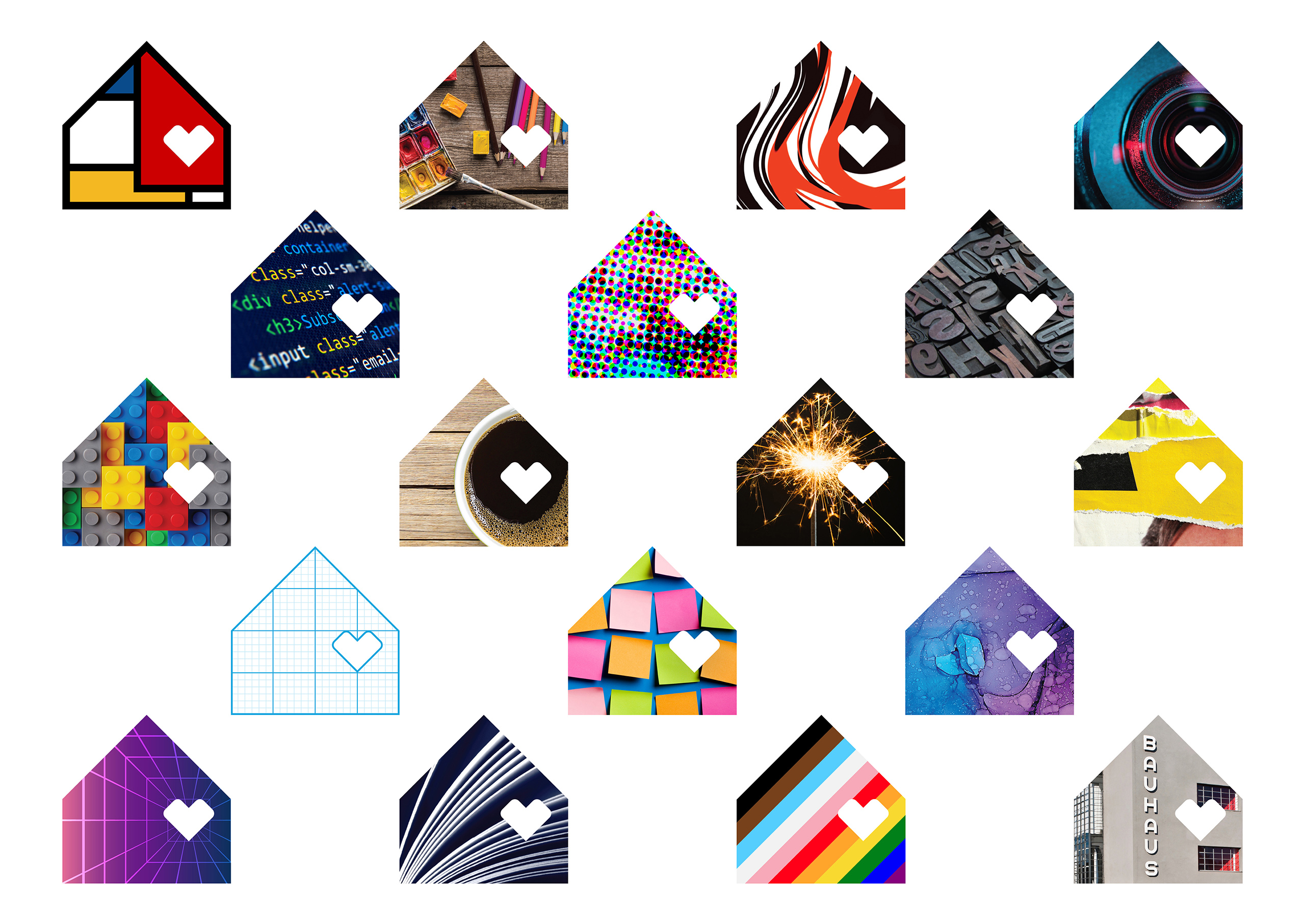
Our Heart Haus brand symbol can be used as a portal for countless visual expressions with a focused point of view, highlighting imagery that reflects the work we do every day, the tools we use and the things that inspire us.
WHO
Brett Gerstenblatt
Executive Creative Director
Chris Lehmann
Creative Director
Evan Boisvert
Lead Designer
Ferenc Gaspar
Designer
Joshua Wiedenroth
Designer
Kelsey DeGenaro
Designer
Jane Wongjirad
Designer
Karen David
Designer
Matt Rayel
Designer
WHAT
Logo design
Brand identity
Motion
Playbook development
Colleague experience
WHEN
2022


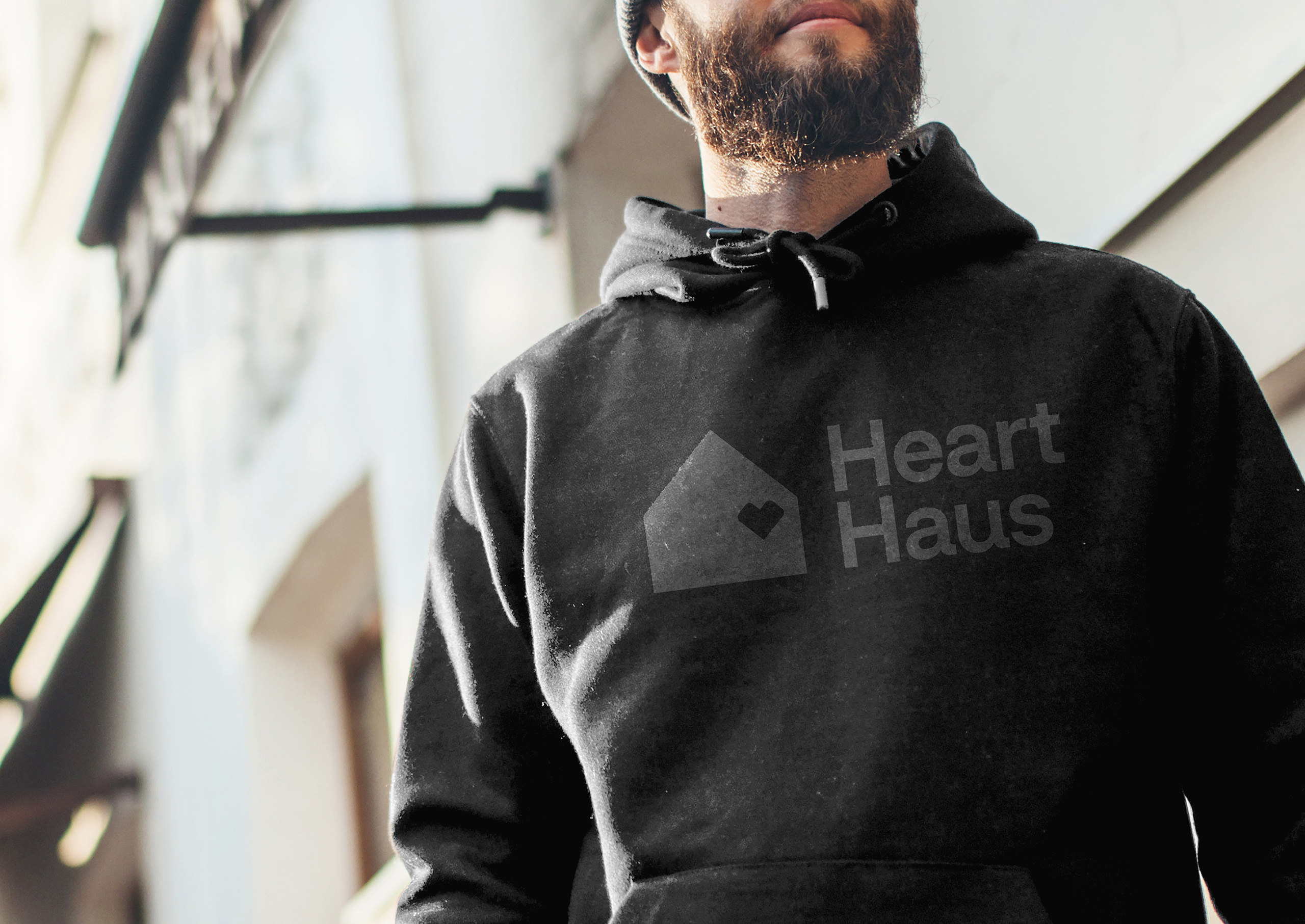
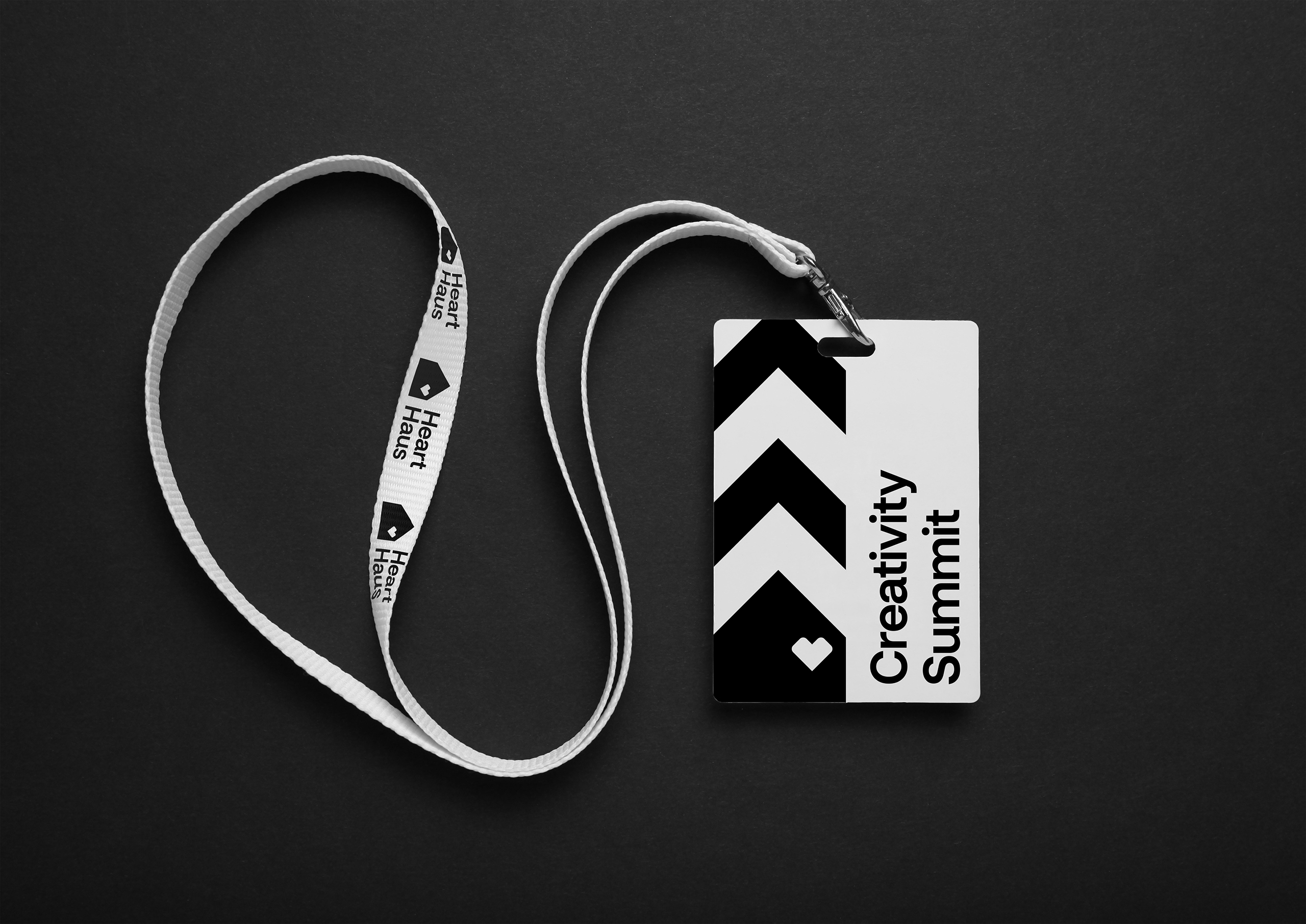
Bringing our heart, and our art, to everything we do
Nodding to our Enterprise purpose, this vision set the tone for the future of our in-house creative team at CVS Health.
The decision to integrate three established creative teams into one unified team was the driving force for developing this new identity. We knew we would need to tell a clear, renewed story of who we are to our internal partners, but also seize the opportunity to present ourselves as experts in the industry.
The name
From a massive list of options, Heart Haus was the name that resonated the most amongst the working team. Two syllables offered a direct link back to our most distinct brand asset while also conveying that we would all now be “under one roof”.
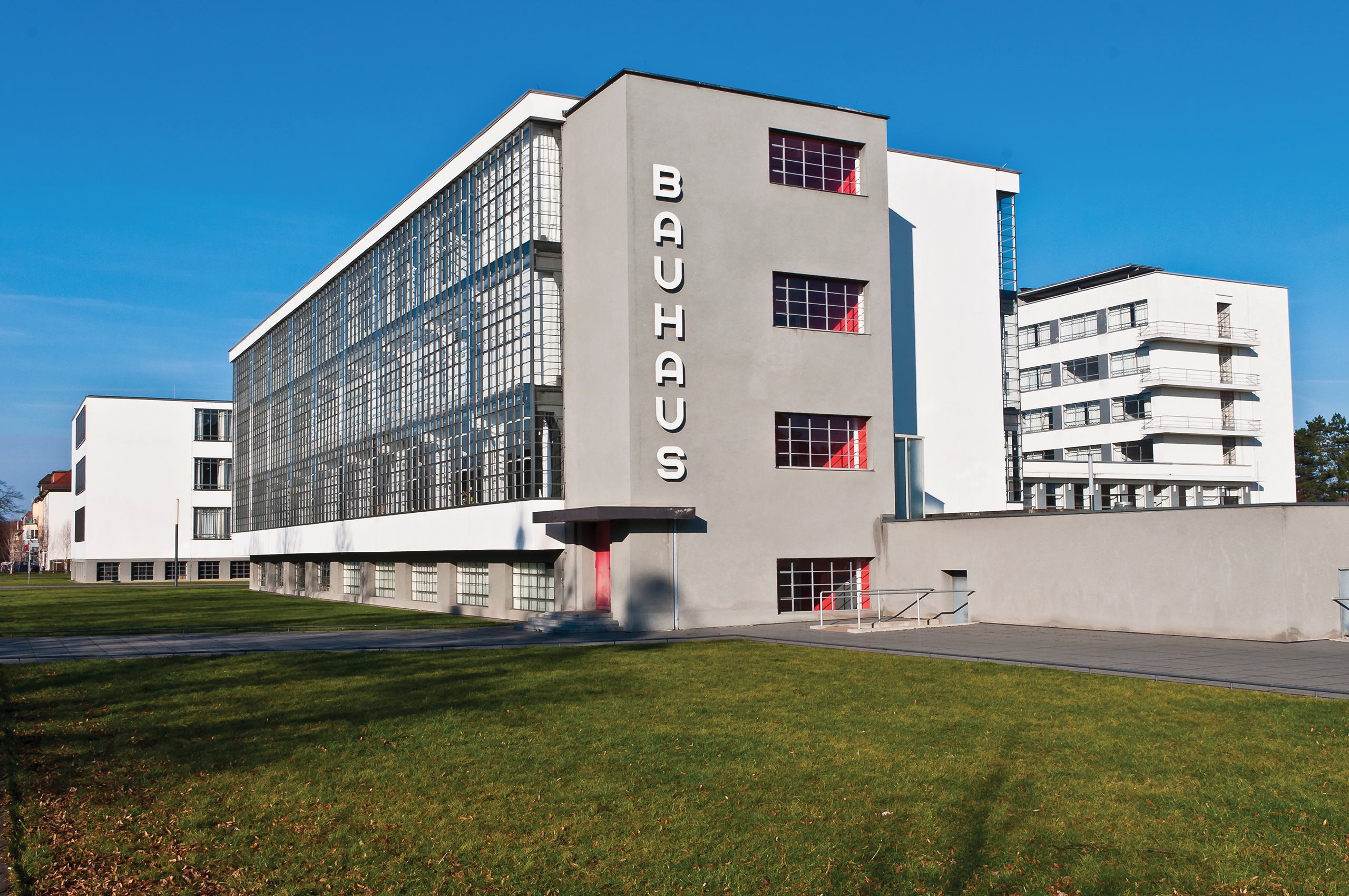
Additionally, the German spelling of “Haus” was employed, paying homage to the Bauhaus, the influential German art and design school and movement. This choice beckoned us to be inspired by Bauhaus principles and apply them to our modern-day solutions.
Logo design
A team of designers conducted a two-week sprint on logo options, casting a wide net that spanned from ones that felt promising but safe, to others that flexed too far. Wordmarks, symbols and monograms that used simple geometry and primary colors prominently, per Bauhaus tradition, were considered.
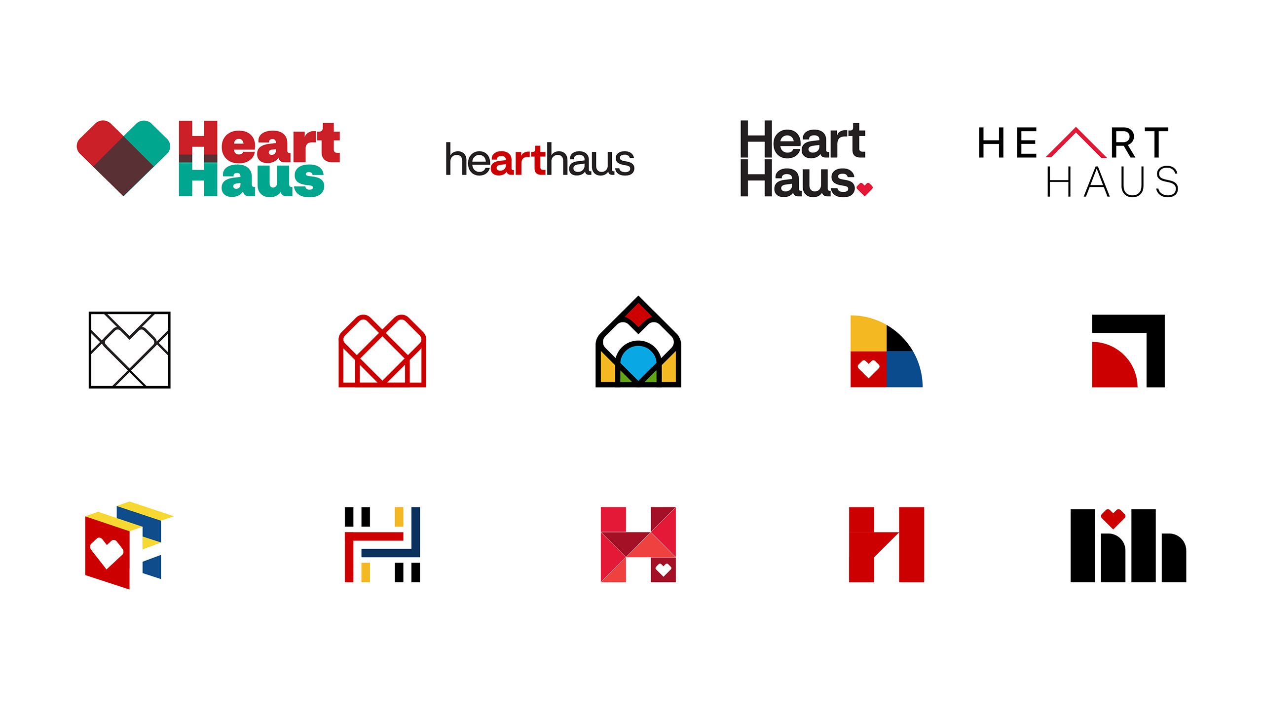

At the end of the day, the name begged for something that signaled “Heart” and “Haus”. As we refined our exploration, we honed in on solutions that incorporated these two elements.
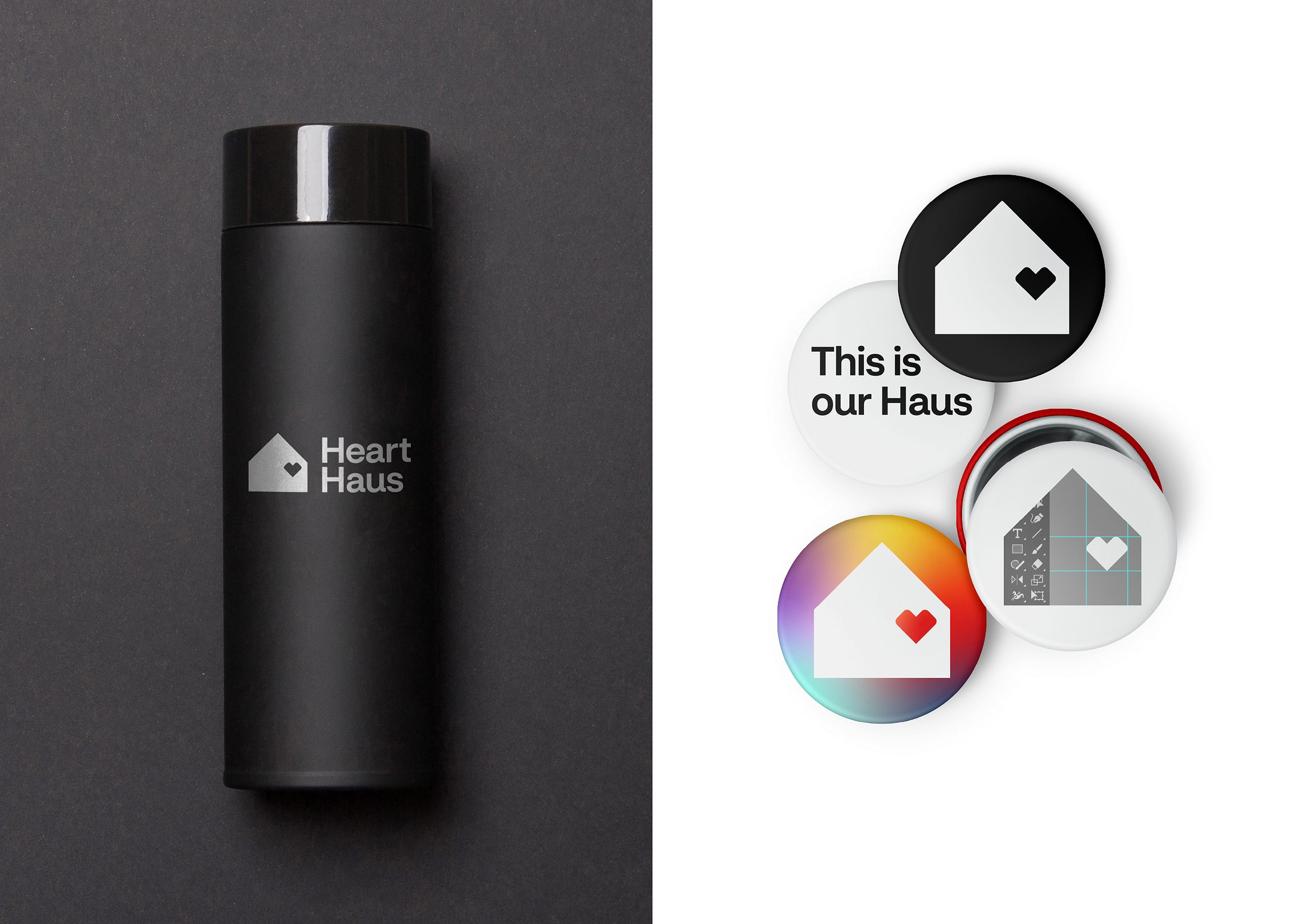
The final logo solution expresses that our hearts reside within the Haus we built. The proportions and spatial relationships trace back to the CVS Health heart. Our Haus symbol is simple and geometric, and the heart is carefully placed on its grid. The same attention and care is applied to the logotype.
The reveal
After the basic identity elements for Heart Haus were established, our team reached out to our good friends at (add)ventures to help us create the launch video. Partnering closely on the concept and implementation of these new elements, we went from kick-off to launch in another two-week’s time.
The Heart Haus launch video was shared with our creative colleagues at our first Town Hall, revealing both the team’s name as well as the visual identity. It capped off a series of updates regarding the integration of legacy teams into this new entity, providing a visually engaging finish and instilling a sense of pride and new horizons.
The results
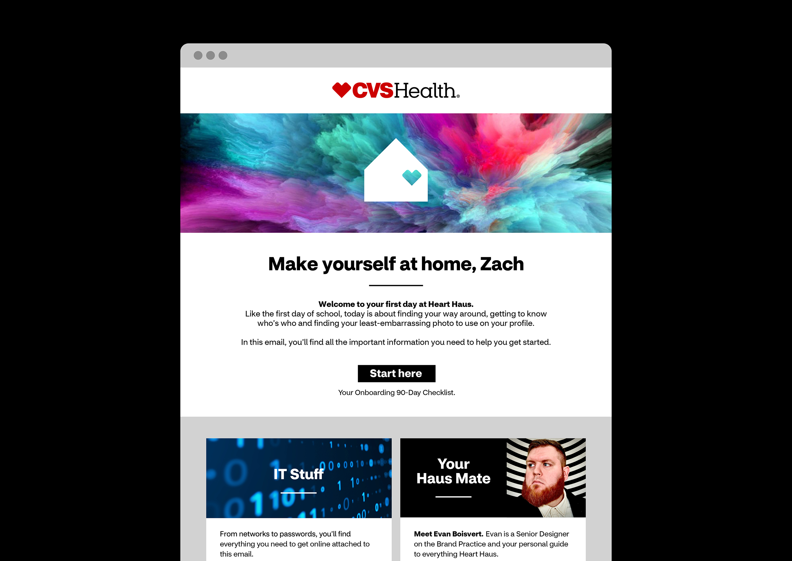
We built a rich identity that is used to inform the Heart Haus colleague experience, spanning onboarding materials and internal communications.
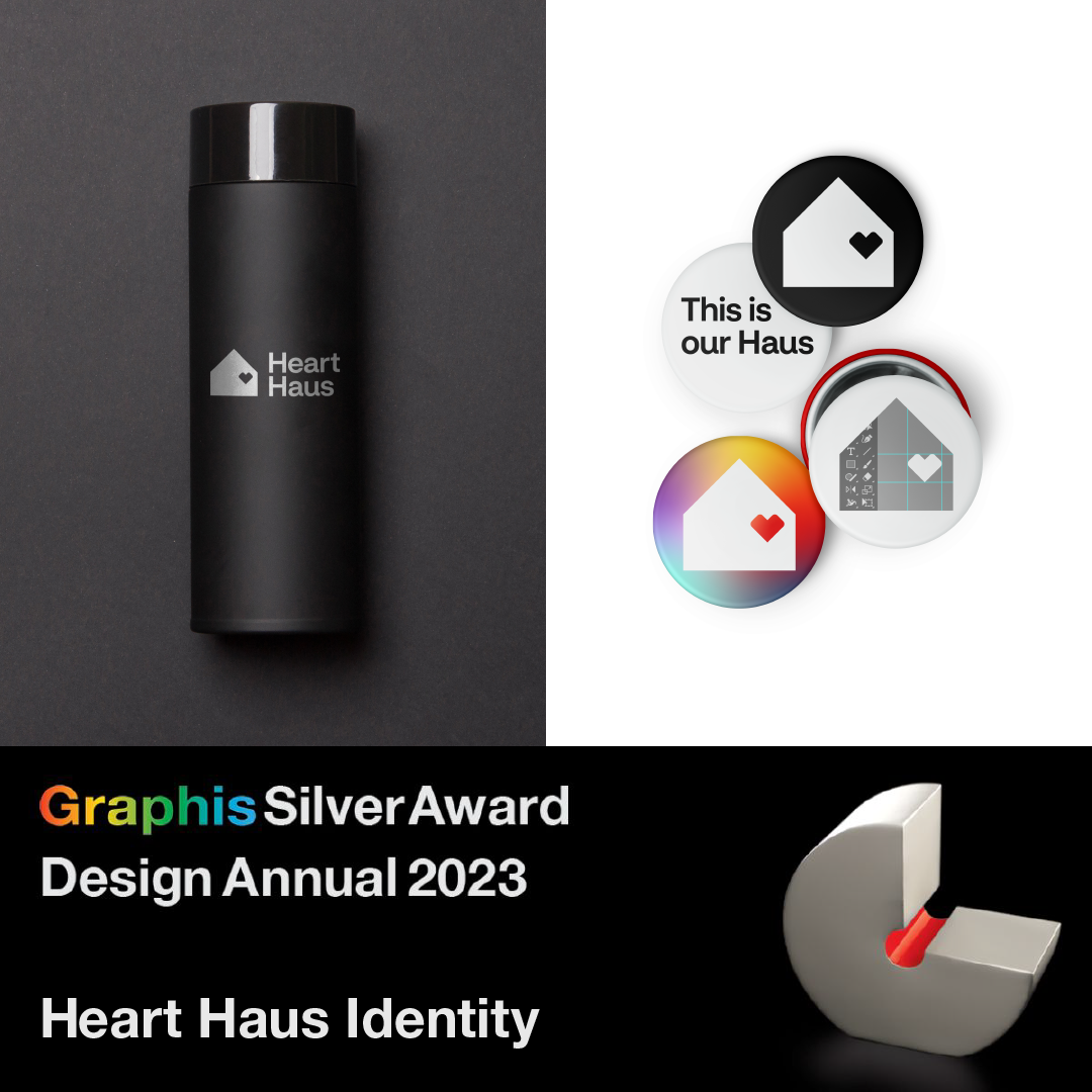
On top of what was an exciting launch year, the Heart Haus identity was honored with a Graphis Silver Award for Branding and a Gold Award for Logo Design as part of the Design Annual 2023 competition.
